MOTOROLA BRAND IDENTITY
After years of declining sales and brand neglect, Lenovo’s acquisition of Motorola provided a unique opportunity to completely reimagine and revitalize this formerly iconic American brand.
The new brand expression had to distinguish Motorola from the competition (with a fraction of their budgets) while aligning to Lenovo’s new master brand positioning strategy of “different is better”.
I persuaded Lenovo leadership to reverse the company name change from ‘Moto by Lenovo’ back to Motorola and subsequently redesigned the Motorola wordmark.


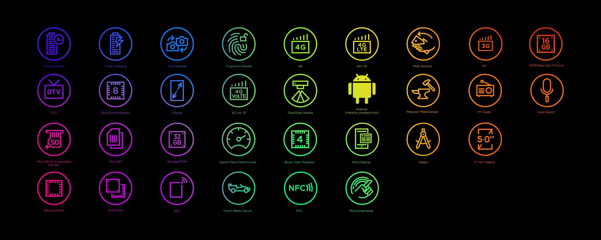
Horizontal, stacked and vertical configurations for both solid and keyline provide maximum flexibility across different formats.
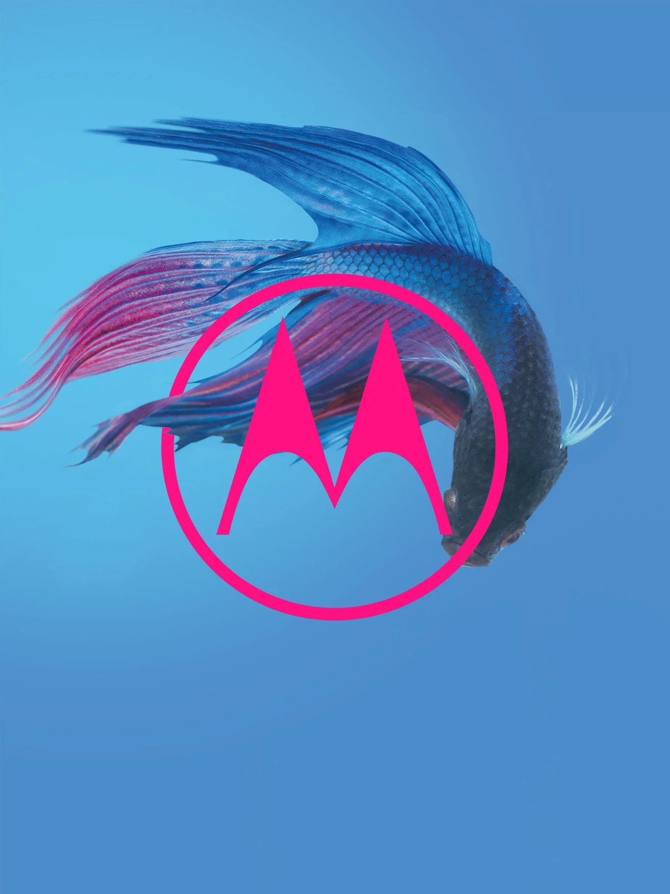
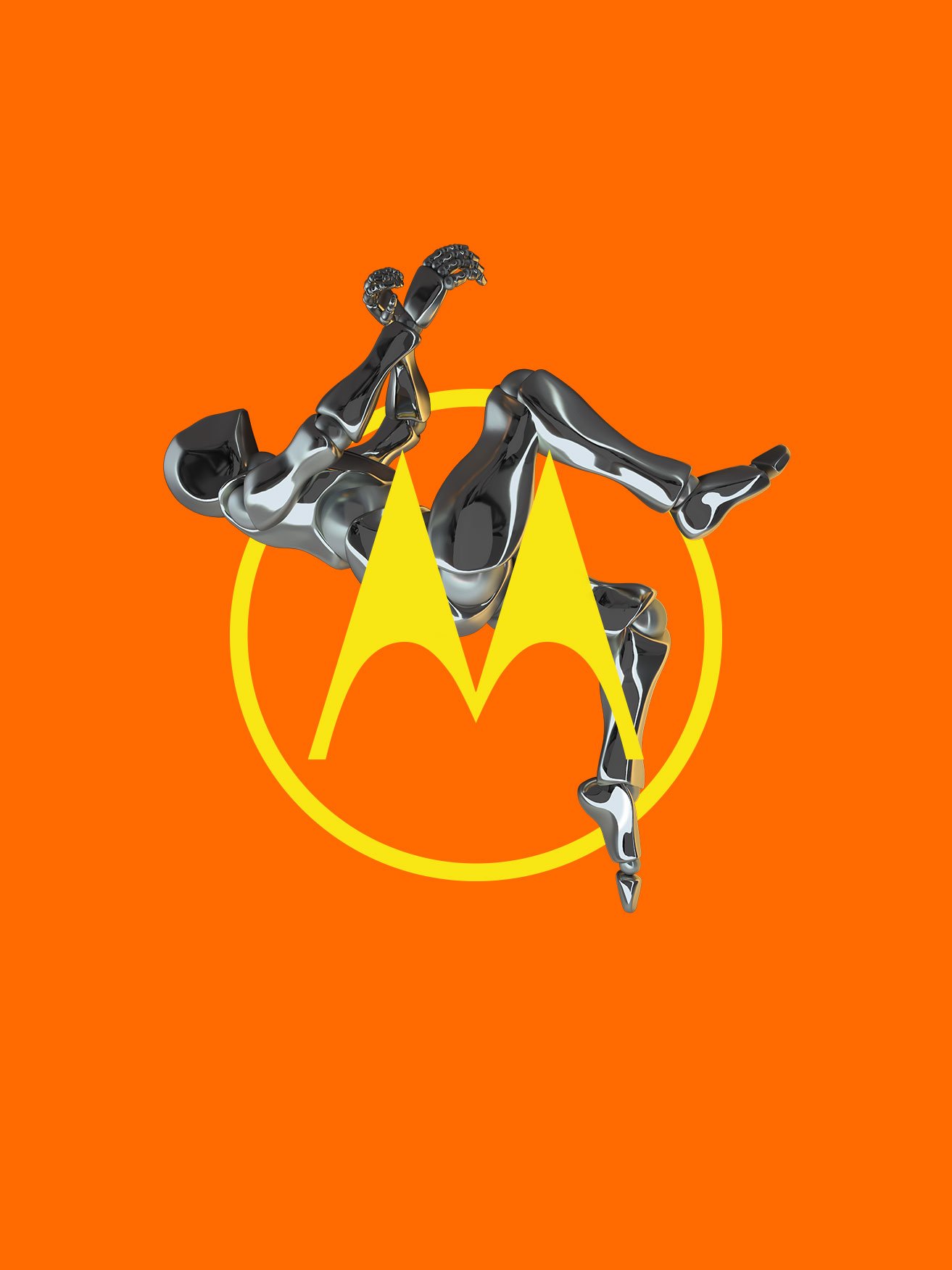
Motorola’s iconic Emsignia logo in solid and keyline versions represent the brands special and different character.
Infill and break-out Emsignia versions enable the brand to be more expressive and playful.


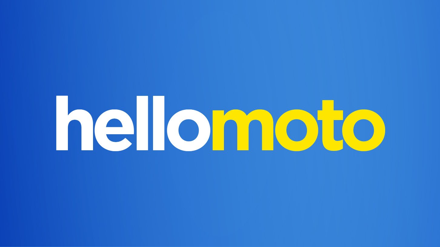
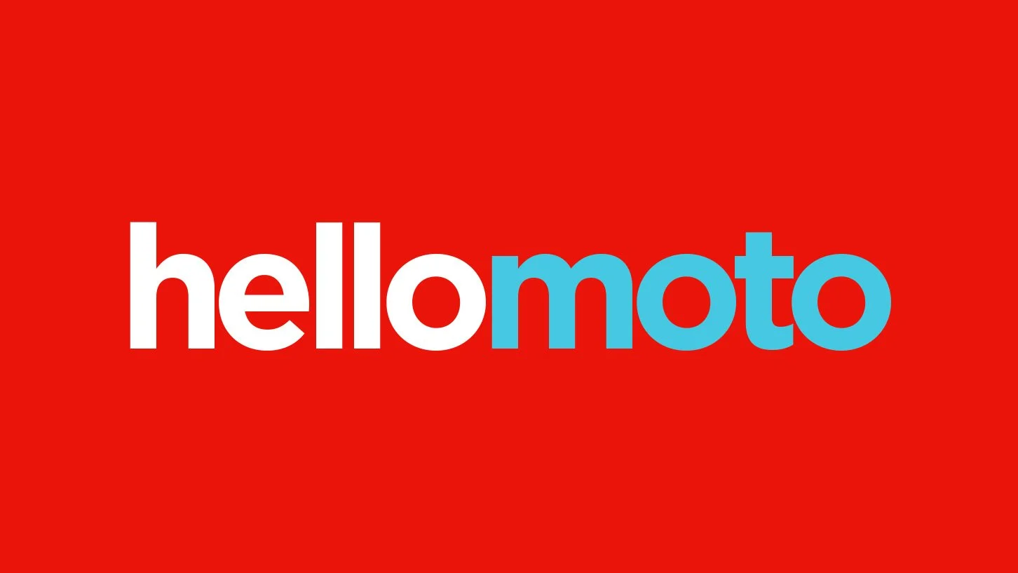


Hellomoto was reintroduced and extended to both build on Motorola’s brand heritage and provide additional messaging flexibility.


Combining color with natural textures and materials plays an important role in creating Motorola environments.


Casting and wardrobe design are also integral to creating Motorola’s challenger spirit.

Designing a flexible brand framework that stretches from value to premium in a cohesive, integrated way.

Ensuring unboxing is a connected experience between marketing, packaging and device wallpapers.

A looped video sequence for retail demonstrating the high fidelity and color vibrancy of Motorola’s smartphone screens.


